
Crafting Crescent: A behind-the-scenes dive into my brand's origin
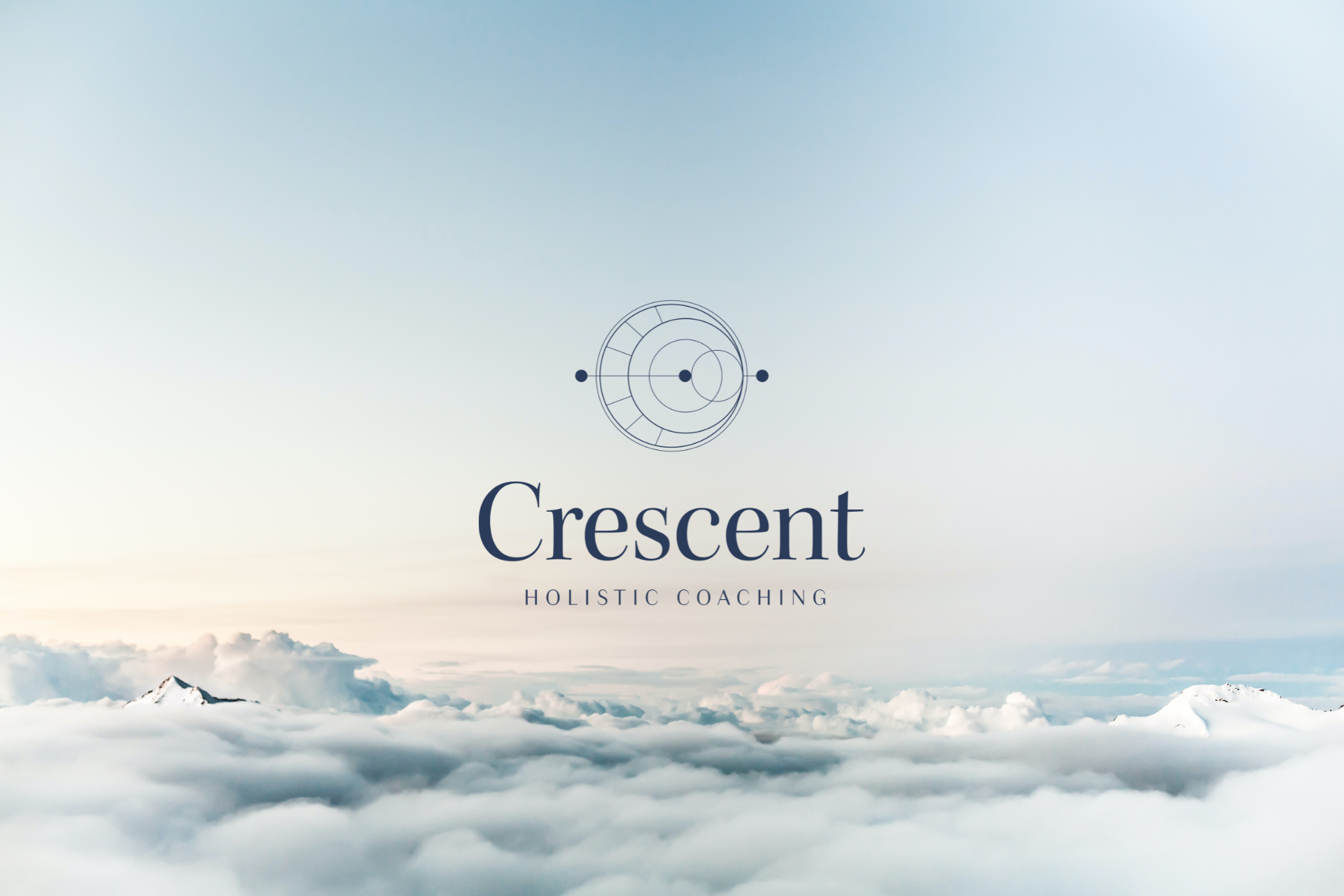
Creating a brand, to me, goes beyond a catchy name and a cool logo; it's about crafting a narrative that reflects who I am, what I stand for, and how I want to present myself to the world.
No pressure, right? ;)
Luckily, I had an idea of how to get started. Drawing from my past experience as a digital marketer, I knew I needed to consider elements like an icon, wordmark, overall vibe, colours, fonts, and more.
Despite my background in handling various brand identity projects—from product labels to rebrands and tone and voice development—I felt a bit uneasy. This time was different; it was my brand and my face, raising the stakes.
I took some time to mull over my vision for a few months before seeking assistance. When I finally brought someone on board, I had a clear (yet flexible) idea of what to name my coaching business and a sense of its identity.
Let me walk you through the journey—from initial research to final designs. Read on if you're curious about the story behind my brand or interested in my approach to the project. I hope you’ll enjoy learning about my process.
Exploring and Researching Symbols
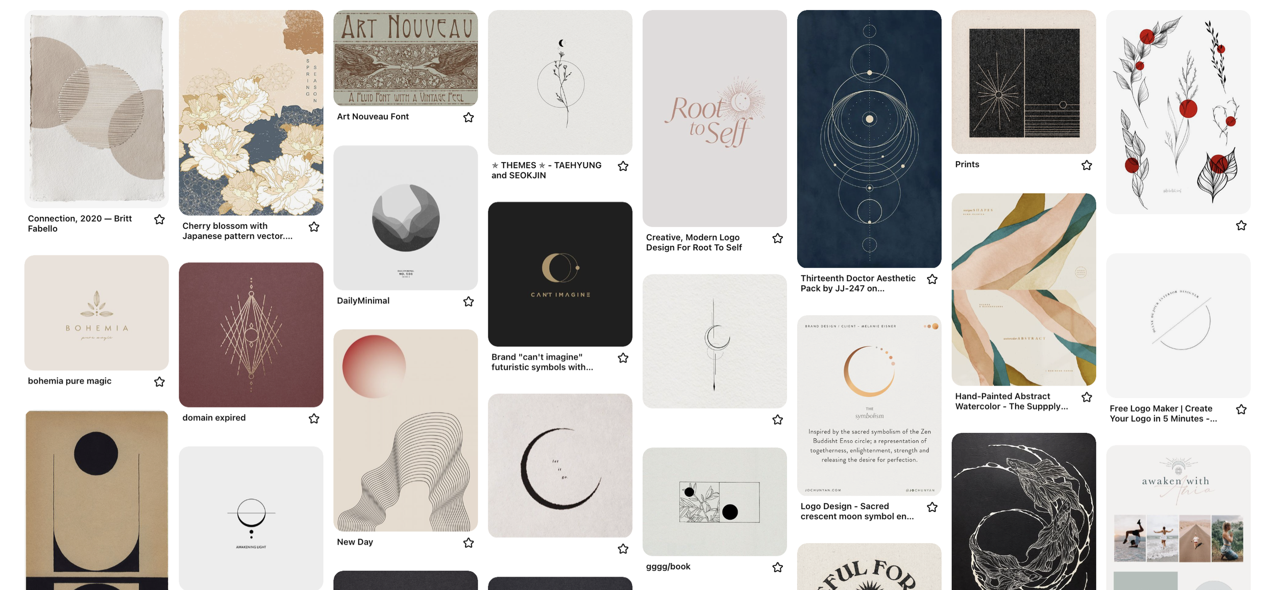
I started this branding journey researching and collecting ideas, both skills I consider to be strengths.
Having been fascinated by symbols and myths for quite some time, I already had a selection of symbolism books in my personal library. Exploring these felt crucial as they could potentially shape both the logo and the name.
I casually flipped through these books on occasion, making note of anything that resonated with me for future reference. Right from the start, I envisioned something nature-inspired, ethereal, whimsical, yet maintaining a professional touch. I delved into sun symbolism, various plants, ocean imagery, and more to understand their symbolic meanings, narrowing down my focus.
Despite exploring a range of possibilities, I found myself consistently drawn to cooler hues like blues, greys, and greens. Balancing professionalism with a hint of shadowy or moody elements felt essential to the overall aesthetic.
The Birth of "Crescent"
After numerous months of exploration and a robust shortlist of options, my attention consistently gravitated back to the moon, particularly a crescent moon.
The symbolism spoke to me on multiple levels. It not only mirrored the intuitive, feminine energy I aimed to infuse into my brand and coaching style but also captivated me with the representation of waxing and waning cycles. For me, this symbolizes an enduring cycle of transformation, where darkness transitions to light, from new to full, in an ongoing rhythm.
This imagery felt like a powerful metaphor for our personal journey, illustrating how we can continuously transform, grow, and illuminate our aspirations. I found it to beautifully capture the empowering essence of what working with a coach can achieve.
Plus, the meaning embedded in this symbol resonated deeply with my values, the audience I wished to attract to my business, and the perspective I held toward my coaching work.
I sat with this name for a while until it became clear that no other was a fit. Crescent Coaching felt really right!
(Of course, I checked if the business name and domain were available, and phew, both were!).

Navigating the Visual Design
After settling on the brand's name and icon, I moved on to creating a moodboard to shape the brand's look.
I started by gathering ideas from a Pinterest board, collecting things I liked—workmarks, colour schemes, icons, and fonts. Initially, it was a bit of a free-for-all as I collected thoughts and ideas.
Realizing I needed extra help, I brought in Chalayne, a dear friend and long-time design collaborator. Despite having a good starting point, her expertise was crucial in clarifying and developing my vision.
Using my Pinterest board as a starting place, Chalayne then drafted four simple and different brand concepts for me to consider. We went through a process of elimination, figuring out which shapes and elements worked best. For colours, I fell in love with the idea of using dusk hues, a perfect backdrop for any celestial imagery like the moon photos I planned to regularly use.
The logo itself is packed with meaning. The outer circles symbolize our wholeness and completion through coaching. The crescent itself represents the new beginning of a coaching journey, divided into sections embodying both moon phases and the International Coaching Federation's eight core competencies. The trio of dots and a line signify the coaching process—start, midpoint, and completion—a continuous momentum toward our aspirations.

The End Result — And A Heartfelt Thanks
With Chalayne's skill and collaboration, the final result exceeded my expectations. Crescent Coaching's brand identity is a blend of symbolism, purpose, and a strong tie to coaching.
I extend my sincere gratitude to Chalayne for all her support and patience bringing this vision to life.
Confidently, I can say that the Crescent Coaching brand identity encapsulates everything I aimed to convey and represent.
I appreciate the richness packed into the logo and brand identity. It feels comprehensive to me and serves as a visual representation of a coaching journey, my contribution to the world, and a commitment to supporting people's transformations.
To connect with Chalayne about branding and graphic design work, please inquire on her website: www.chalayne.com.

Explore the signs that you may be outgrowing your current role or career path, from shifting values and fading motivation to feeling pulled toward something new.